Deconstructing my photos
When I switched from Sony to Fuji, I had no idea how much photography would actually grow on me.
Of course, I wanted to get better and take nicer shots, but since that first trip in Marocco, I started getting more and more into photography and focused on learning as much as I could and trying to improve from one photo shoot to the next.
This is the reason why I joined online photography classes and courses, bought books on topics I am interested, watched famous photographers talk about technique and photography on youtube and so on.
In the meantime I was getting out more, shooting everything from old buildings to lakes, from air shows to high mountains.
However, all this shooting hasn’t helped me produce tons of amazing pictures.
I do better and better (by my own standards) but there are only a handful of pictures I would gladly present both on social media or to a pitch/contest/etc.
So the question arose again. How can I improve my photography and get not only to a bigger keeper number but also being able to fill a bigger photo book that I can gladly pitch or show to people?
And that was the moment when it hit me.
What I needed to do was three things:
1. Enrol in a serious photography course. A course with exams, homework, tests and photo submissions. A course where professional photographers judge and review your photos.
2. Submit a number of my pictures to a professional photographer for reviewing them. Sort of a portfolio analysis.
3. Deconstructing what I believed to be my decent shots.
Now, on this post, I won’t dwell on the first point but rather focus on the second and third because I find them more practical for most people.
Not everybody is interested or has the time to read through 1000 pages of course material, take exams, take shots to be reviewed and so on.
In this article, I will try to blend the second and third points and cover a lot of subjects. Matters that will explain the reasoning, feelings, technique and so on upon getting that shot.
Now, before I start, I need to mention three points that I found necessary upon deconstructing my photos, and that will be touched in every analysis.
1. My photos must have a clear subject;
2. My photos must draw attention to the main subject;
3. I need a simple photo. It must draw to the subject and not congest the overall image.
The three points above will be mixed with the most important thing for me when it comes to taking photos: every picture tells a story.
What I want, and I assume what all photographers want, is that people get the photo, get the mood, understand the story. If you have to explain it, then, well, maybe that photo is not as good as you thought it to be.
Now that we got all of that out of the way, we can start with the first photograph.
After looking at it I want you to think about what it means. What I wanted to capture in it.
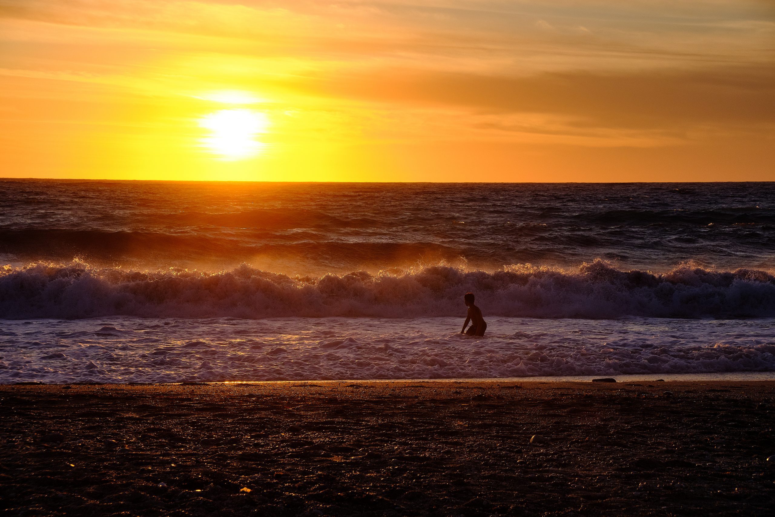
The story behind this picture is simple.
I was in Lefkada on a gorgeous sunset, after just taking photos of kitesurfers when I noticed this kid playing in the water. For me, this was the perfect opportunity of catching a photo that means joy, happiness, freedom.
Since there were others on the beach, I had to go for a 55mm zoom in and try to balance the child with the setting sun, thus trying to use the rule of thirds in my photo.
Also, in this picture, I have tried placing the sky one third in the picture instead of splitting the picture in half.
What I love about this picture is the fact that due to the setting sun, the backlight falls in the picture and prevents me from actually seeing the kid’s face. It could be anybody. It could even be a younger me.
Also, upon taking this picture I have tried to convey a bigger depth, letting the eye wander all the way up to the sun and I have tried doing it by using layers.
Now, upon receiving the grade and explanation from my professional photographer I was told that this is a nice result, with more interest due to the four layers I had in the picture.
I was told that extra to those layers, I had the human element also, but that the picture would have worked without his inclusion also because it doesn’t necessarily add anything to the picture and the positioning in the frame is not the most interesting, and by not being a surfer or posing it means that there is no story either.
Overall, a shot that works well.
What do I think of the analysis when I deconstruct my photo?
1. Do I have a clear subject? Well, here I am torn. My focus was on the kid, enjoying freedom but since my reviewer didn’t get it, maybe I was wrong.
2. Did it draw attention to the subject? Well, I would have to say no since it was noted that the human element could have been skipped from the photo.
3. Was the photo simple? I removed all other people or buildings from it so on this point I could say I reached my goal.
The reviewer also said that the human element’s positioning was not the most interesting and I have to agree with that.
Due to my positioning and the fact that I needed to use a 55mm lens, this was the closest I could get without including other elements in the picture, elements that would have congested the scene without adding anything of value to it.
Overall, while I love this picture and I might even print me a small A4 to hang on the wall to remind me of a fabulous holiday, I don’t think that this photo is technically perfect.
Does that prevent me from trying to post it, use it or sell it on the internet? Actually, no.
While I am sure that during a contest my photo will fail due to the reasons stated above, you always have to keep in mind one important thing. Your audience, your viewers are not technical.
While a perfect composition, symmetry, rules add to a picture there are other things that matter just as much.
Colors, the season, the location, the sun, the sense of freedom the picture evokes and many, many more might make your photo a hit while the critics consider it a miss. It all boils down to who are you trying to reach with your picture. If you try to reach judges then it might be a miss.
If you show it to people who just got back from a holiday, if you post it in the winter, if you show it to parents or to people who are nostalgic about things, then it can be a hit.
Now, having finished with this picture, I will jump on to the next photo I got reviewed.
Before I start, I admit that I haven’t sent a lot of info to my reviewer attached to this photo, a fact that you must usually do, when you are trying to have something graded/evaluated.
I took this picture with my old Sony A6300, while on a two week trip to England.
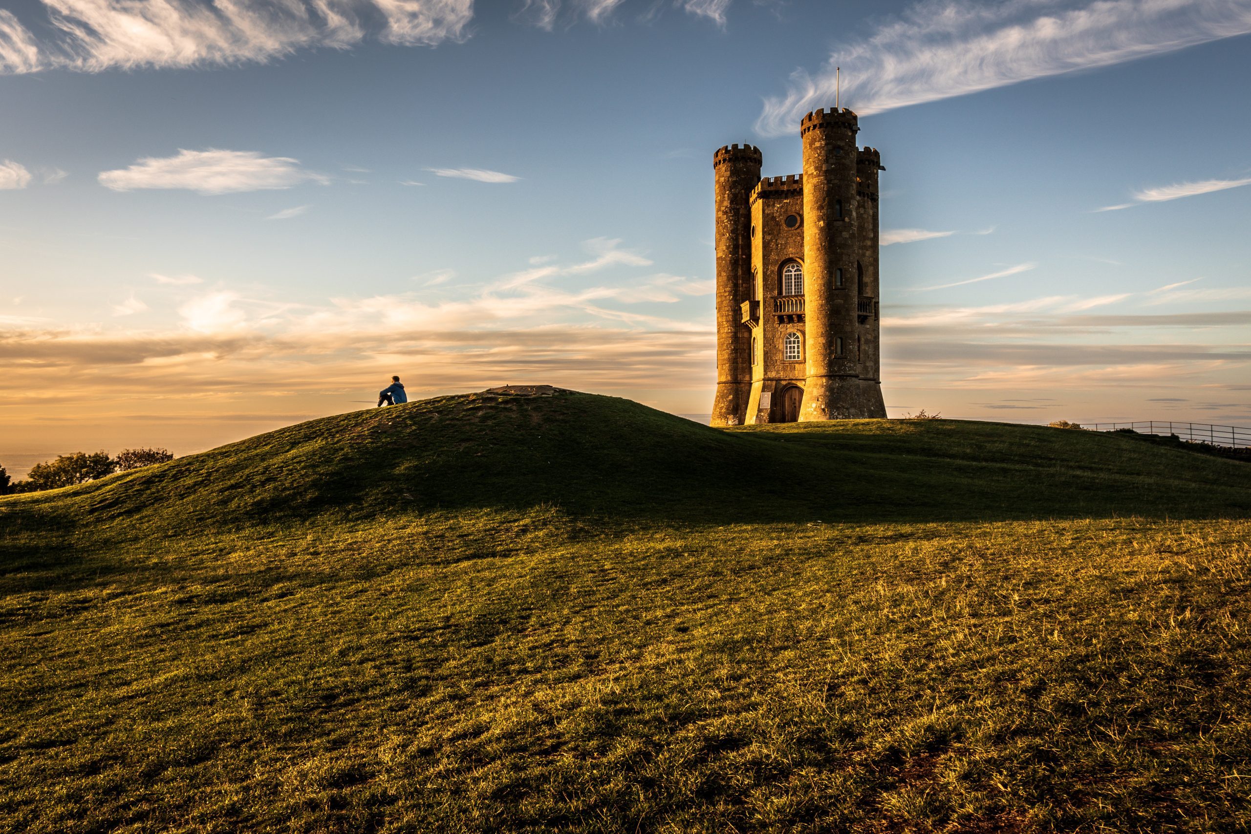
Those were the final days before I needed to be in London for work, and in a way, this picture meant looking back over my trip, contemplating it before work kicked in.
I could easily call this photo contemplation or I could name it “looking forward” because while my perspective was to look back over 12 days of wonder, another person might look at this picture and identify with it by eagerly looking on what is next to come.
Upon receiving the review I read that it was a lovely shot of an iconic location. It was a good thing that I included a figure for both scale and human interest and that the light was great. A good capture even though the processing does look a little overdone.
What do I have to say now about the picture?
1. Does it have a clear subject? Yes, I think it does. While the Broadway Tower is majestic all eyes fall on the man on the small hill before it.
2. Did I draw attention to the subject? I think I have accomplished that.
3. Is the picture simple? By using the rule of thirds, placing the sky right, moving around and removing other people from the picture (by camera position not by edits) I think the photo looks simple.
I do agree that it looks a bit overly processed but I never managed to edit my Sony pictures perfectly. If there is a photo I regret not taking it with my Fuji’s then this is that picture.
I really think that a simple jpeg with my Velvia settings on would have done more justice to this beautiful scene.
All in all, I think that this is a picture that stands the test of technicality, but unfortunately it fails a bit when it comes to colors and editing.
Too bad I don’t have the raw from it or I would have tried editing it again, maybe getting a better result this time.
The last picture I will address today is a picture I took in Romania, a picture posted on my IG account and one that troubled me for some time.
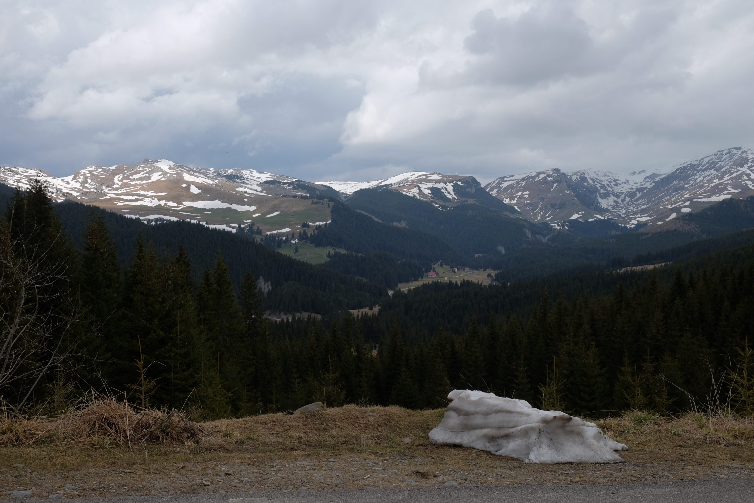
This was one of the compositions where I kept wondering if it is OK, if I have done it nicely so I thought I’d better send it to a reviewer and find out.
I stared and stared at the view in front of me and while it was a great view I missed one important thing: I had no idea what my prime subject would be. This was kind of a… Landscape whole picture. If it works, it works, if it doesn’t…
So I will start with what the reviewer said and work my way from there. He said that he loved the clouds and the mood they gave to the picture. The mountains were a fine view although a bit flat. The trees, a nice mix that occupies a lot of the frame, though at the same time, only occupy the midground. The foreground is the weakest area of the picture and that the block of ice just doesn’t sit well with the rest of the picture, since it is not very attractive and it would have better been excluded from the picture.
Now, before going to the usual review like I did before I must address one important thing that my reviewer said. As usual, with layers, I split the picture into the foreground, midground and background and this is where my biggest mistake lies. Upon taking a picture you must ensure that all parts of the picture are beautiful. It doesn’t matter if I have a perfect background if my mid and foreground are crap. The picture, the final result, will be crap.
He even suggested that by cropping the foreground, the picture would be much improved so a lesson from here is to pay attention to all parts of the picture because they all add up.
Coming back to my points let us see how it stands.
1. Do I have a clear subject? To be honest, I don’t.
2. Is my subject focus, clear? This also fails.
3. Has all the clutter been removed and this is a simple, clear picture? I think that the picture is filled with things, therefore, lacks simplicity.
Knowing all the above, and considering this place is about two hours drive, here is what I will try to do when I get back.
1. Look for impressive skies again.
2. Search for a source of lighting. A sunset with clouds would be lovely.
3. Split the picture part by part. Maybe by pieces, I will be able to find better compositions.
4. Search for my main subject and use different techniques to show it to the viewers.
I have chosen these three pictures today because they are a mix of:
1. Great colors, but lesser technique;
2. Good technique, but weaker editing;
3. Parts of the picture being great and parts being awful.
By simply looking over these pictures I am able to correct many mistakes from my flow of work and, hopefully, move on to take better pictures each time I get out.
This is just my thinking, but if you are serious about photography, then you have to have the courage to get your pictures reviewed by professionals.
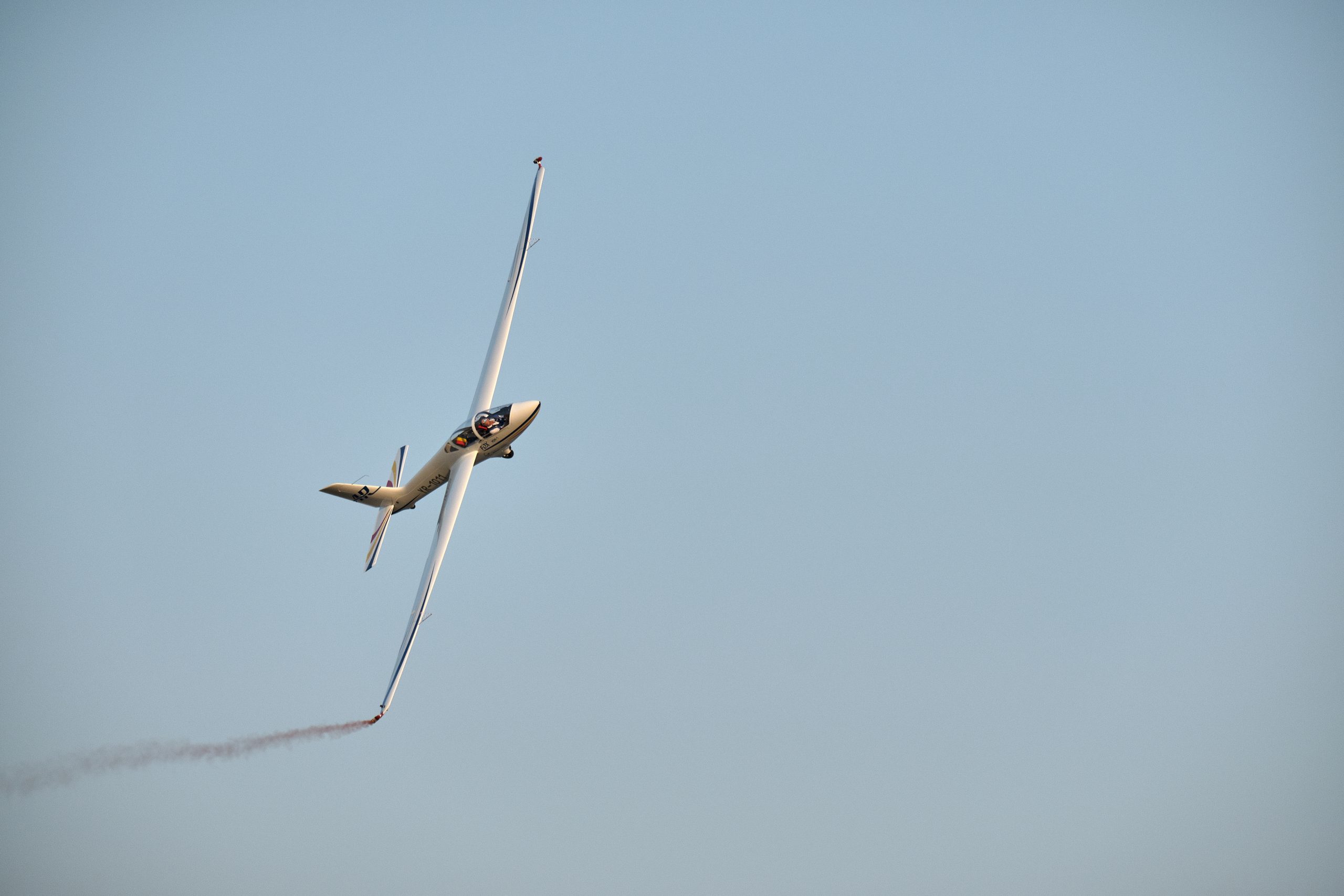
Even if I only reviewed three photographs, I can assure you that the rest of my photos (cover photo and the one from Meteora being the sole exceptions) were also reviewed by a professional photographer.
Actually they were parts of assignments taken for an online course I am following now, a course that I feel really adds a lot to what I know in photography.
The pictures are not perfect and are not to be judged as a whole. They are used just to emphasis certain techniques like freezing motion or leading lines, etc.
By having 2 professional photographers reviewing my photos, is making me more confident that I know some things, that I master others, that I lack in others and provide me with a clear path to what I must study and practice in order to improve my photography.
Having your pictures professionally reviewed may hurt, you might get a bit disappointed, but in the end, if you are tough, you will learn a lot. And you will remember those lessons the next time you go out looking for a shoot. And that will help build you as a better photographer.
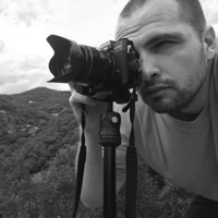
“My name is Stefan Panaitescu, I am 38 years old and I am from Bucharest, Romania.
I work in sustainability and corporate social responsibility and I love my job.
I am an avid traveler and in my spare time I run a travel blog and I try to get out as much as I can and shoot with my Fuji cameras.”


Verj A
June 26, 2020 @ 5:49 am
For a neophyte photographer like me who wanna try photography… this is an amazing piece.
Verj A.
June 26, 2020 @ 5:50 am
^who wanna try in-depth photography
Stefan Panaitescu
June 26, 2020 @ 10:57 am
Thank you so much for your words!
It really means a lot to me!