MASS MADE SOUL
Thank you, Adam! We really appreciate this opportunity to learn a little more about you and the fantastic work you have been doing. But we’ll get there in a moment, so could you start by introducing yourself?
The short summary is I’m a designer who’s had a lifelong passion for photography. I started out at a young age wanting to be a car designer, but I ultimately shifted into more generalized industrial design (design of mass-manufactured products). I was born in England, but I’ve lived in the USA for most of my life, first in the San Francisco Bay Area and more recently in the countryside near Baltimore on the east coast. Over the years, my career has encompassed user experience (UX) design and product management, and now I have my own company, The Enigma Bureau, where I mostly focus on user research for tech clients. I also spent 10 years at the design consultancy frog design, which is famous for designing the early look of Apple products.
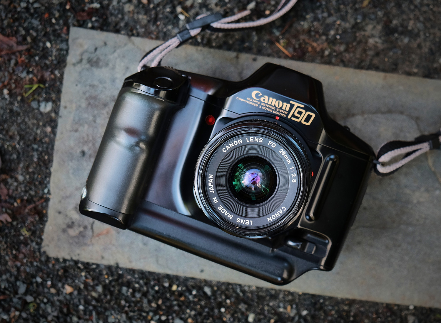
I’ve done photography steadily since high school, mostly travel, landscape and urban architecture photography. I started out on film, including a short period using a Fujifilm 645 medium format camera, but mostly with my trusty Canon T90, which I still have. I switched to Pentax digital SLRs in the early 2000’s, and Fuji almost 10 years ago. I love how I can get completely absorbed photographing and time both stops and goes by in a flash!
Finding your MASS MADE SOUL project on the web was one of the most surprising discoveries in recent years and a breath of fresh air. Would you like to describe it, so our readers know what we are talking about?
Thanks so much! The site is my way of sharing my love of mass-produced products that have character and soul. I photograph them and write about their design and development based on extensive research. A lot of the products are from the 1960’s into the 80’s but there are much more recent things as well. It’s a pretty eclectic mix but with some focus on typewriters, computers and cameras. I’ll also occasionally feature packaging and graphics related to the products.
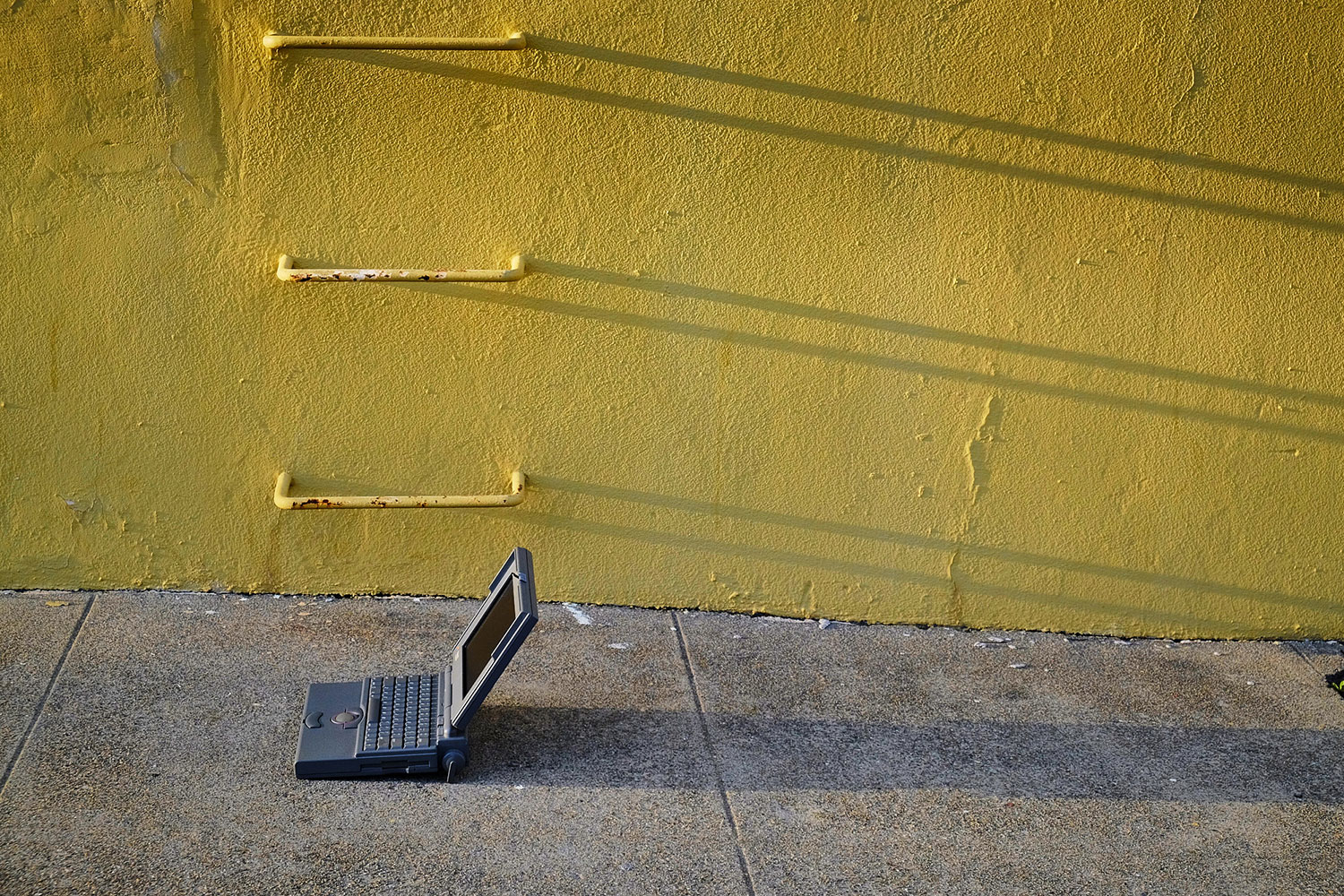


RIGHT: Fuji X-T1 . Fuji XF18-55mmF2.8-4 @35.80mm . f/4.0 . 1/100″ . ISO 200 – Apple Powerbook Titanium
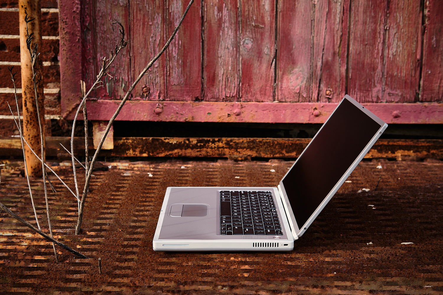
Our teenage years were spent in the 80s and 90s, riding a BMX, playing with a Sinclair ZX Spectrum and watching Knight Rider 🙂
Looking back, there were no better times, and maybe that’s why your website impacted us so much. What inspired you to start this long-term and laborious project?
Growing up my younger brother was the BMX rider and I was the nerdy Sinclair kid, starting with a ZX81 and then a Spectrum! That definitely got me interested in tech, and those machines were primitive but also empowering. The lessons I learned about how computers work and how to methodically diagnose problems are still ones I apply to this day.
Mass Made Soul is really a union of my two life-long pursuits – design and photography. It started when I picked up an Olivetti Valentine typewriter from someone who was selling it near me in Berkeley, California. I think I paid $125 for it, which is a good deal these days. The Valentine is a manual portable typewriter in a distinctive bright red case, and it was designed by the famous designer/architect/sculptor Ettore Sottsass in 1969. It was a product I’d coveted since I was in design school, so I was thrilled to be able to finally see and handle it in person.

I then looked around for more info about it and realized that so many of the photos of it are shot museum-style: against a white backdrop, flat lighting, out of context – really very boring and lacking in emotion. That seemed a shame and not how Sottsass would have envisioned the product (he intended it for “amateur Sunday poets”), so I tried taking some photos of it myself. This then led to me photographing other products I enjoyed over time, and realizing that I should make a website so that other people can enjoy them too, and see them visualized and written about in a way that I hope does them justice. I spend a lot of time researching the design development of each of the products I feature, so it’s as much about uncovering the design history and doing analysis of the design as it is about the pictures.
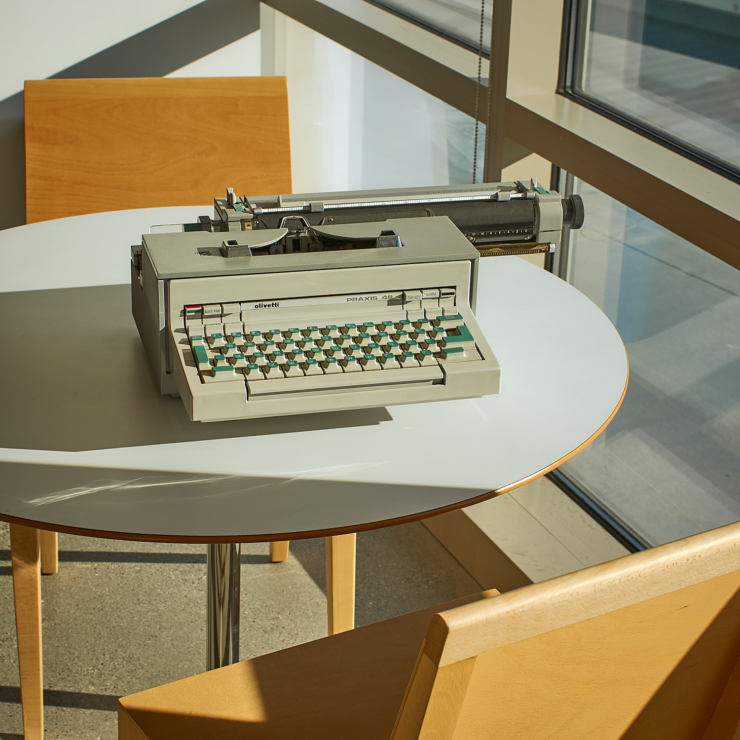
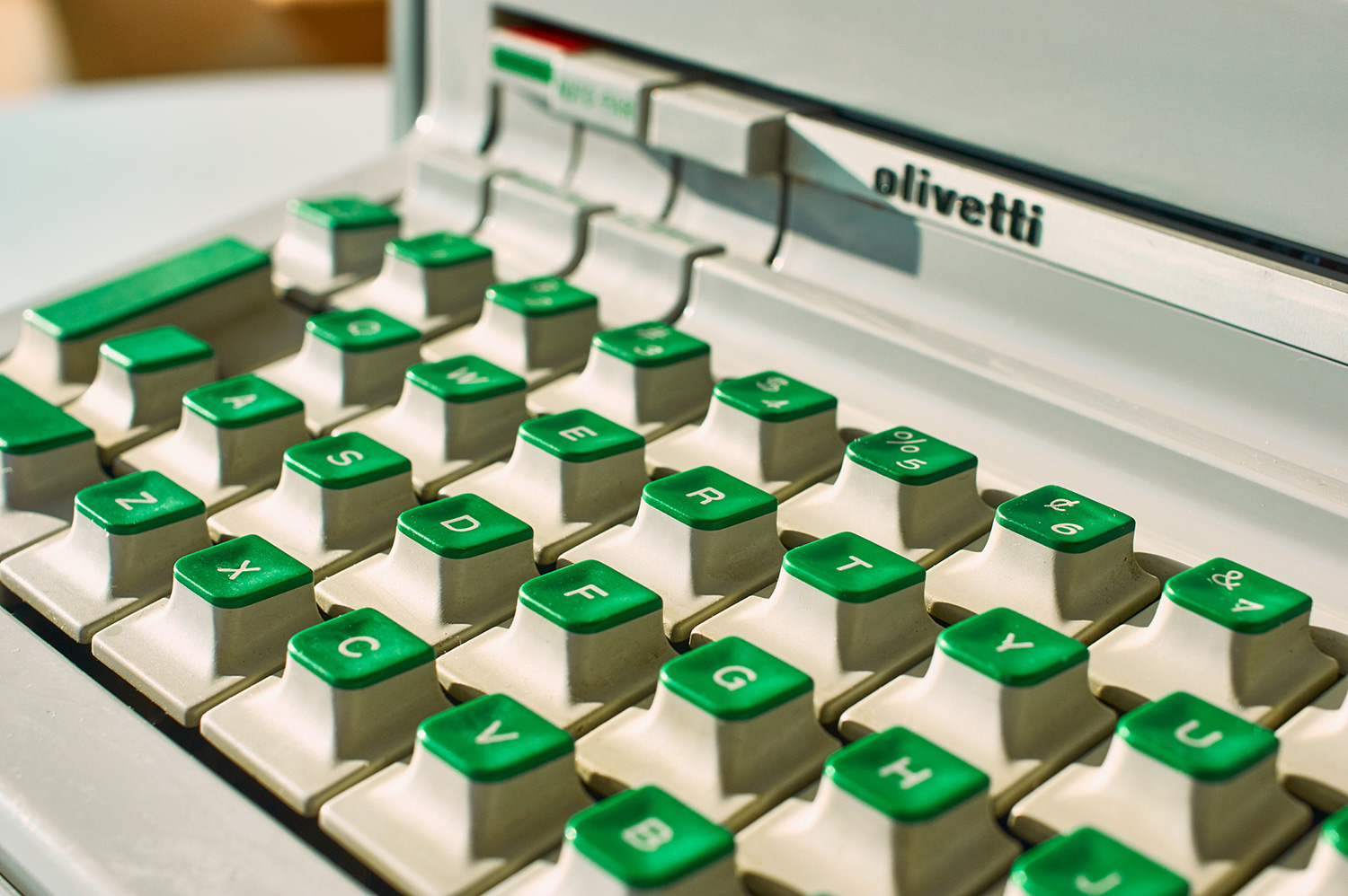

RIGHT: Fuji X-T1 . Fuji XF35mmF2 . f/3.6 . 1/220″ . ISO 400 – Olivetti Lettera
Today’s technology, from the most sophisticated equipment to household items, generally follows the “form follows function” principle, making them efficient of course, but also a little, shall we say, boring. The memory we have of the products from a few decades ago is that fulfilling their function was far from being enough. They also had to have character, being bold even, and that was engraved in our memory in a way that no product of today will be able to do so. What do you think has changed?
The name “Mass Made Soul” is a play on words. On the one hand, it’s about celebrating mass-produced products that exhibit strong personalities, that give you a sense of the original intention of the designer without that intent being nullified by focus groups and manufacturing compromises. I don’t feature one-off or very limited-run products, or art/craft pieces – the focus is on products that one would have been able to purchase from a store.
I want to remind people that consumer products can be fun, quirky and enjoyable as physical experiences – while still being functional. We don’t have to settle for passionless, featureless and static monochromatic slabs and cubes, which is so much of what surrounds us today.
Secondly, the name of the site is a reference to how heavy many of the products are, and that mass is part of what gives them soul. A lot of the products I’ve featured are mechanical or analog, and many come from the 70’s and 80’s when electronics weren’t as miniaturized. As a result, they really had to be three-dimensional pieces of sculpture. Their size, complex shapes and mass make them much more interesting to hold and operate – as well as to photograph!

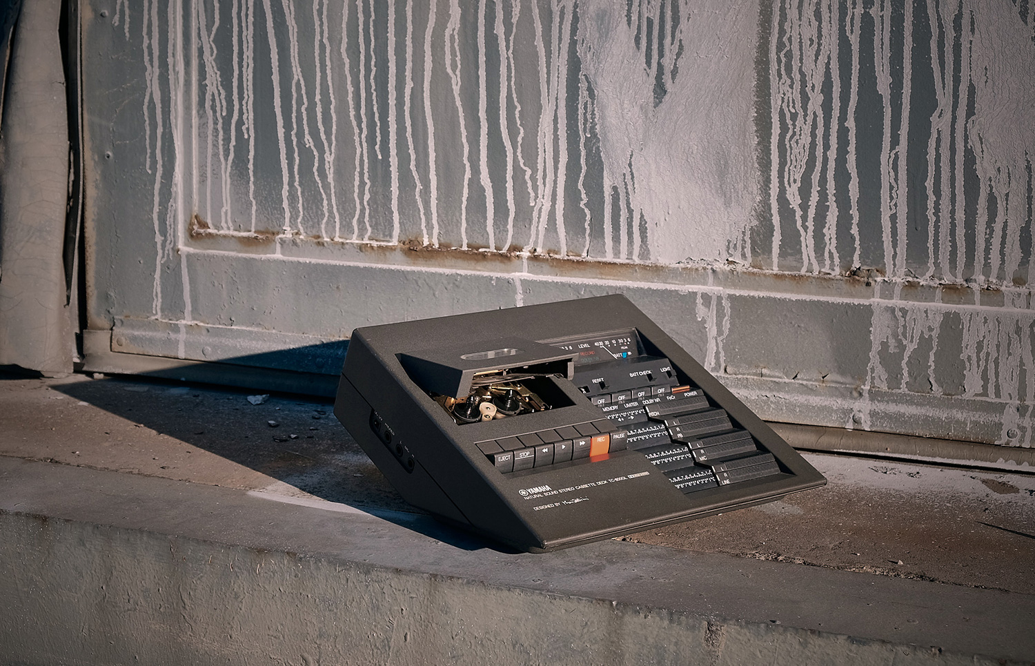
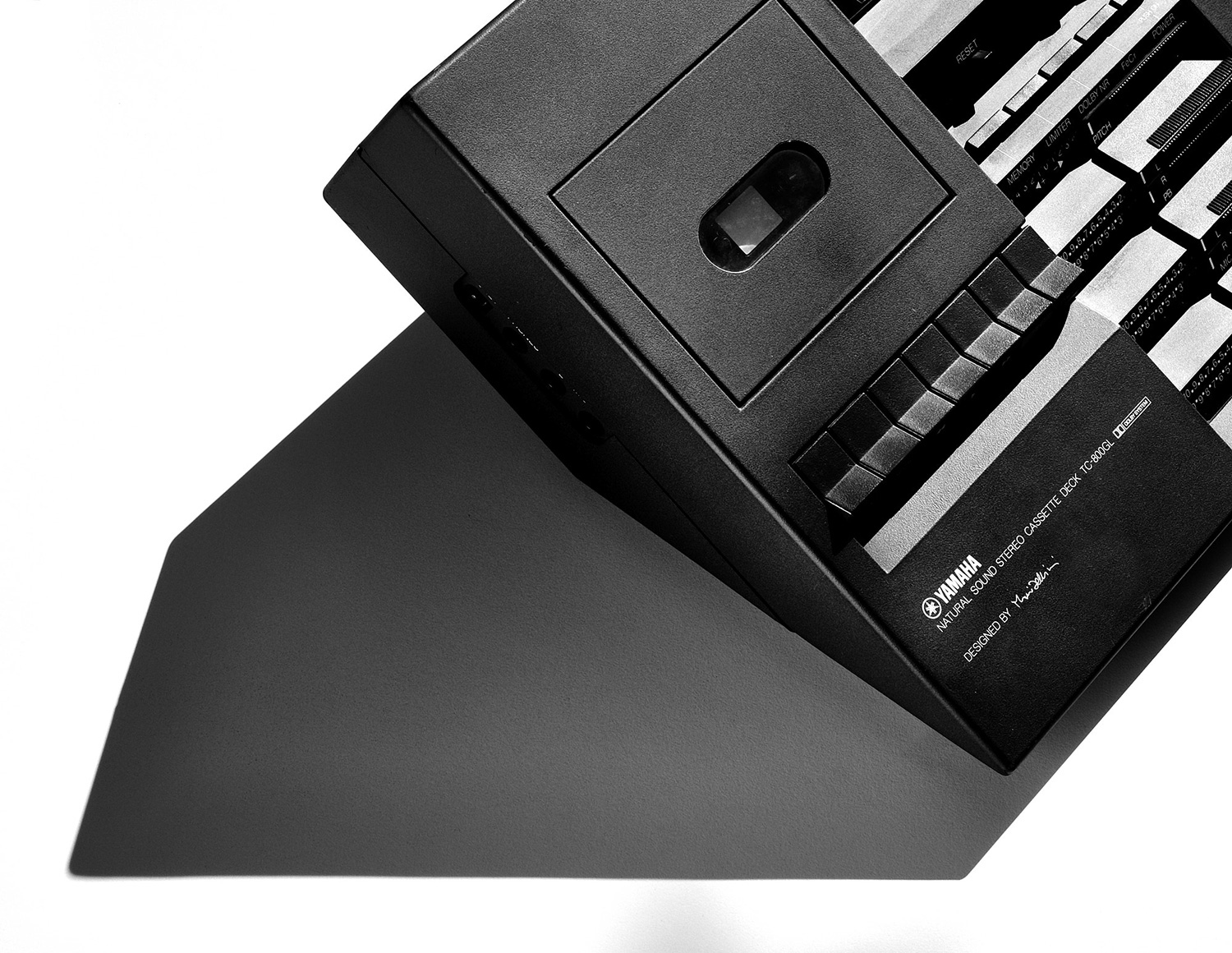
RIGHT: Fuji X-T1 . Fuji XF18-55mmF2.8-4 @48.40mm . f/13 . 1/350″ . ISO 400 – Yamaha cassette
Is it our impression, or the quality of the materials and construction is not what it used to be? Because while we’ve had more LED TV sets than we can count, at our parents’ house, the old CRT television still works!
That is fair to say on the whole. It’s part of why I shifted away from industrial design – I didn’t feel good about contributing to so many short-lived products headed for the landfill. For understandable reasons (such as stagnating wages) people are attracted to finding the cheapest price. But a side effect is that it makes it very hard to sell quality products that will last a long time. This also has major environmental impacts of course, as materials and products move around the globe from low-wage countries to wealthier ones.
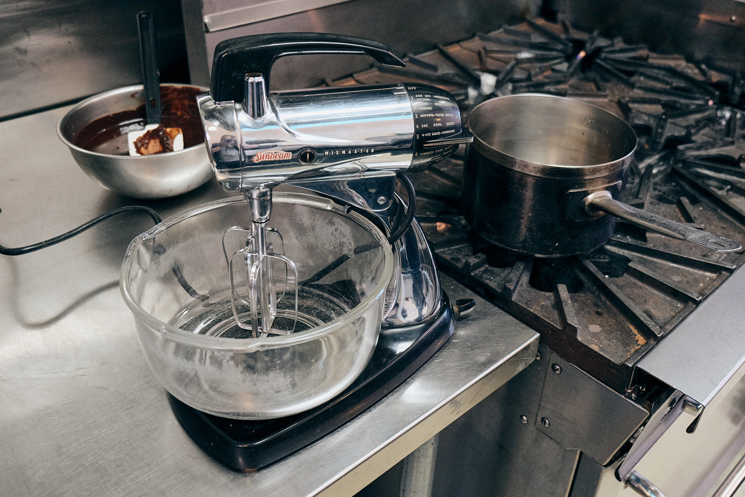
Bringing it back to Mass Made Soul, I photographed some Sunbeam food mixers that belonged to a friend (he has a great little collection and he’s loaned me a number of items to shoot). They would have been made in the US by workers being paid a living wage and are really durable as well as attractive. They’d belonged to his mother, and he and his family still use them to this day, 60 years later.
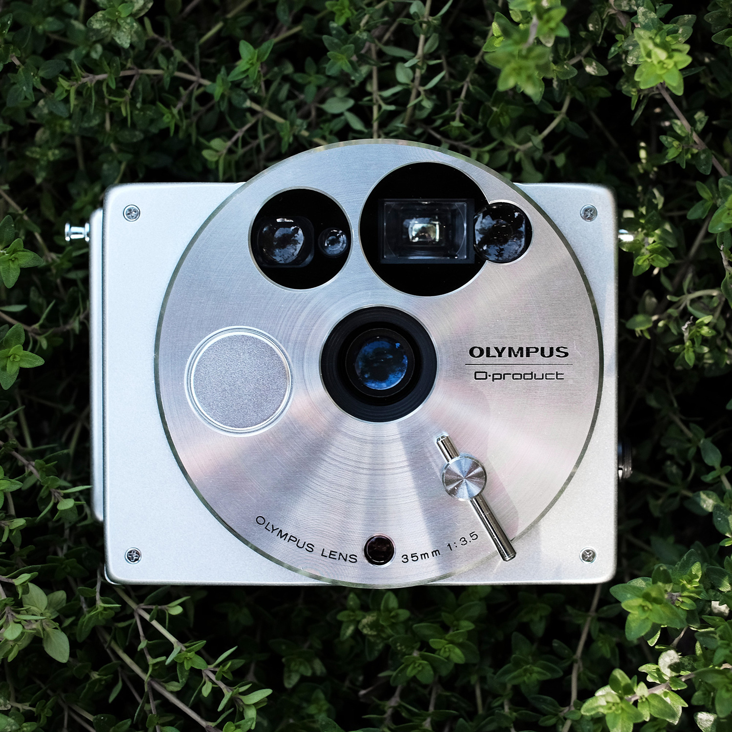


RIGHT: Fuji X-H1 . Fuji XF18-55mmF2.8-4 @34.30mm . f/5.6 . 1/480″ . ISO 200 – Polaroid SX70
Is there any item that you would particularly like to “review” at this moment and of which you still haven’t been able to find a copy?
I am woefully behind on getting some new things on to the site – I have several great products in my possession in the backlog, I just need to find time to do them!
In terms of products I would love to get my hands on, one that comes to mind is the Olivetti Programma 101, arguably the world’s first desktop computer. Italian company Olivetti was an incredibly innovative and design-driven company in the 60’s and 70’s – sort of the Apple of its day — and very progressive in how it treated its workers. I talked about the Valentine, but few people know that Olivetti actually launched the world’s first desktop computer, all the way back in 1965, four years before the Valentine came out! From a design standpoint it’s so much cooler looking than most computers then or since. But they are extremely rare to find (and expensive) these days.
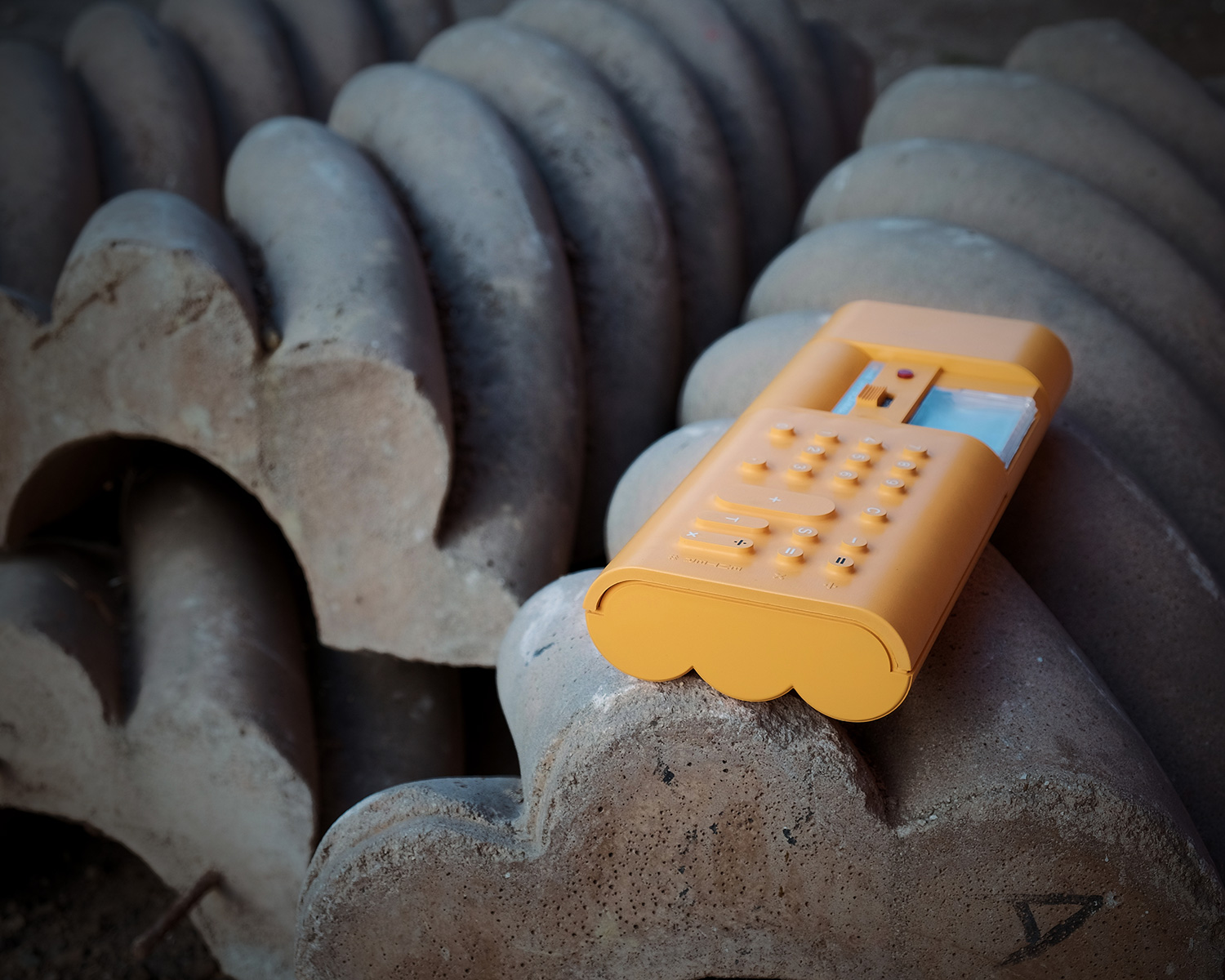
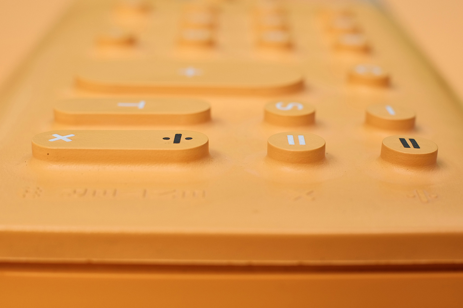
RIGHT: Fuji X-T1 . Fuji XF35mmF1.4 . f/5.6 . 1/320″ . ISO 200 – Olivetti Divisumma 18 Keys
And now we have to talk about photography, of course! Was your choice for Fujifilm equipment purely based on tangible criteria, or did the passion for vintage design also have an influence?
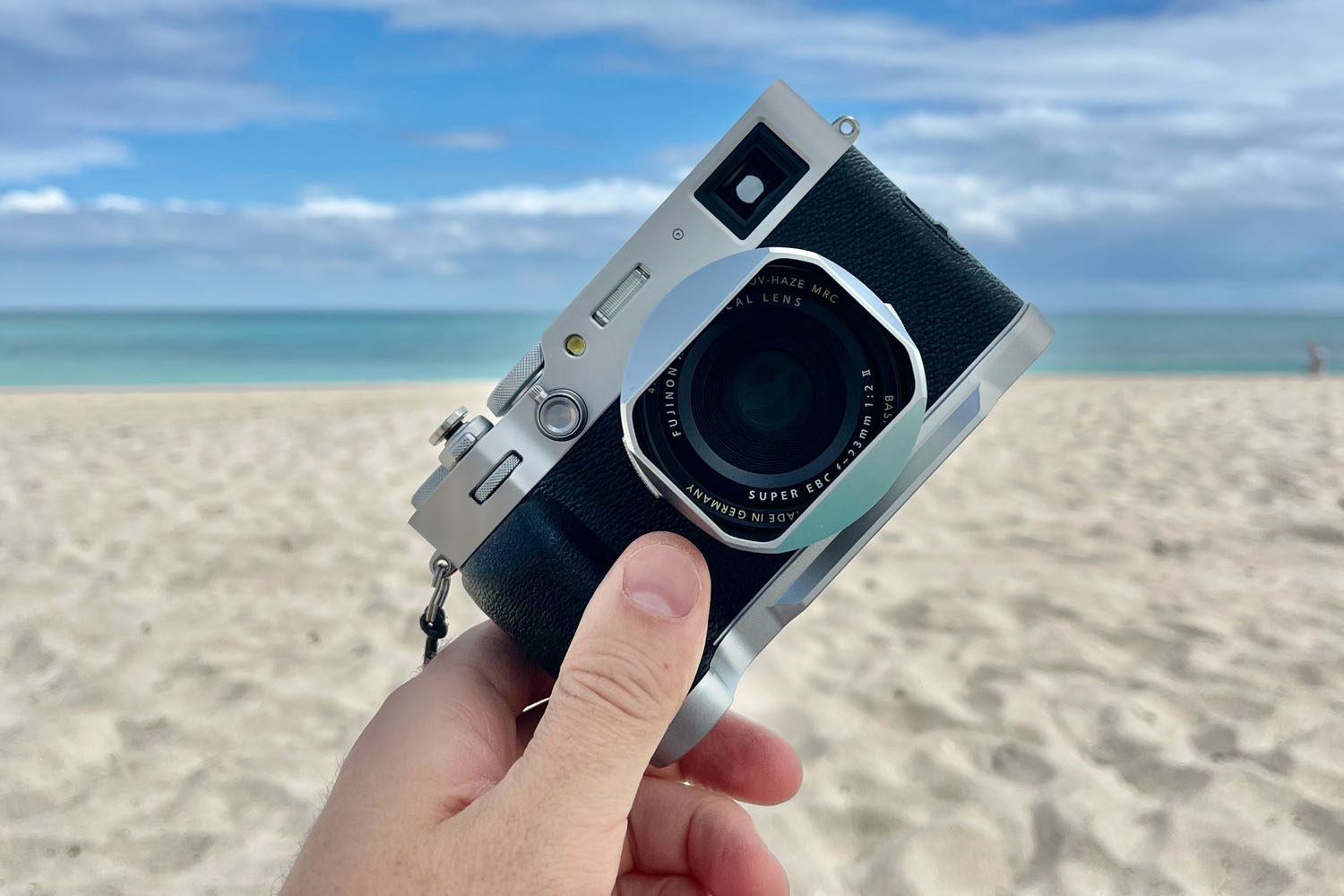
I’ve been shooting with Fujifilm since 2013, when I bought an X100s and made the bold (or stupid) decision to take it as my sole camera on a 2-week vacation to France and UK that my wife and I did. I hardly had the camera for any time before the trip, so it was a bit of a learning curve, but I was blown away by the quality of the images, the colors, the macro mode, and just how much fun it was to shoot with. It wasn’t the vintage design as such that drew me to it, but I very much liked the physical controls and the simplicity. When I’m shooting I’m very immersed in what I’m doing, and the tactility of Fuji’s controls really work for me. I don’t have to stop and switch my brain into electronic gadget mode in order to make an adjustment, I just turn a knob.

What can we find inside your camera bag, and what setup do you use most often to take product photos for your website?
Since the X100s I’ve had an X-T1, and now have an X-E3 and X-H1.
The X-H1 is what I use for all the product shots, usually fitted either with the 18-55, 16-55, or 35 f/2.
Unlike most product photography, I shoot mostly outdoors, and look for visually and texturally interesting locations that will make the product stand out. So when I’m out doing a shoot I’ll be driving around an area looking for unusual places to put the computer, typewriter or whatever the subject is, and often I’m just pulling over on the side of the road and setting up quickly. It’s very minimal – rarely a tripod (though I have a carbon Manfrotto that I’ll bring along), rarely any lighting, but often some collapsible reflectors and softeners to do some management of the sun light.
I like to keep the shooting pretty fast and fluid, I’m not spending ages agonizing. Sometimes I’ll regret this later when I’m reviewing the images in Capture One – I’ll wish that I’d got just a slightly different angle, or what have you. But I think the energy and spontaneity of the shooting comes through in the images, and gives the products a more lively feel. Sometimes I’ll do a tabletop setup to do detail shots where it’s less about seeing the product in a context, and for that I may use LED panels, but I could also just use daylight.


One of the most talked-about topics at the moment, at least within the “Fuji community”, is that with releases like the X-H1, X-S10, or the latest X-H2S, the brand may be looking for common ground with the public in general and, in a manner, abandoning that retro design that sets it apart from all the others and that helped to create such a fervent community of users. And history is full of examples of (huge) brands that, due to a management or design choice, were wiped out of the shelves. Without getting too long, for those of you in your 40s these days, have you ever wondered why you stopped seeing LA Gear sneakers? Well, moving forward, this challenge that brands have between gaining market share and staying true to their hardcore set of users, is it more difficult today than ever before?
I know the X-H1 was a bit divisive, but I think it’s become a bit of a cult camera, and I love mine. The shutter action is so beautiful, and while the X-T1 was a little small and fiddly for my hands, the X-H1 fits me perfectly.
Something I appreciate about Fujifilm is the variety of styles of bodies and ways of interacting with the cameras – you can pick what works for you in different situations. I use the X-E3 and X-H1 in very different ways, for example.
Photographers and hybrid shooters have such a wide variety of ways of shooting it’s impossible to please everyone. I find it funny when I watch or read reviews and people bemoan how complicated digital cameras have become, yet in the next breath will say “Well it would be nice if it had this feature or that option” – we’re our own worst enemies at encouraging camera manufacturers to increase complexity!
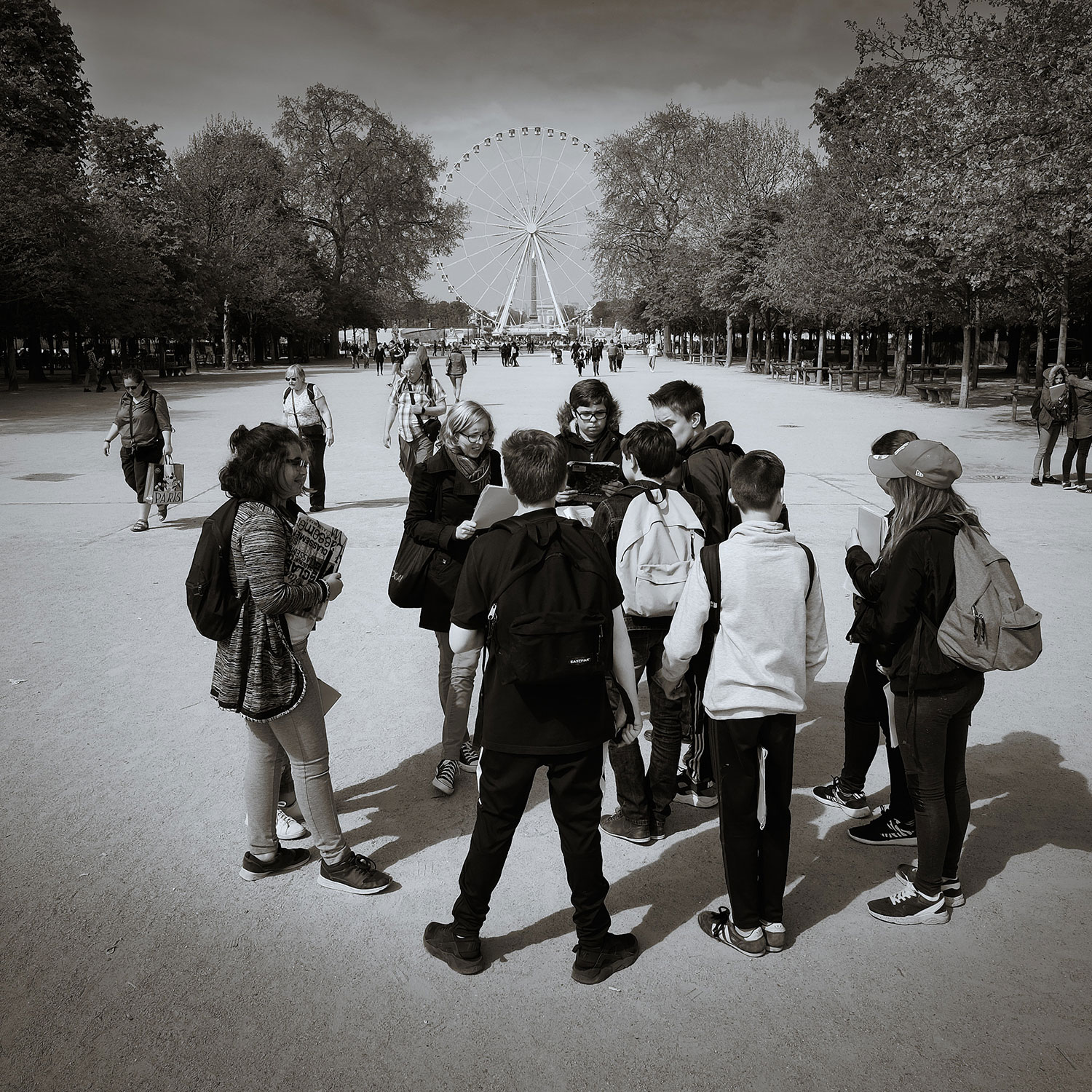

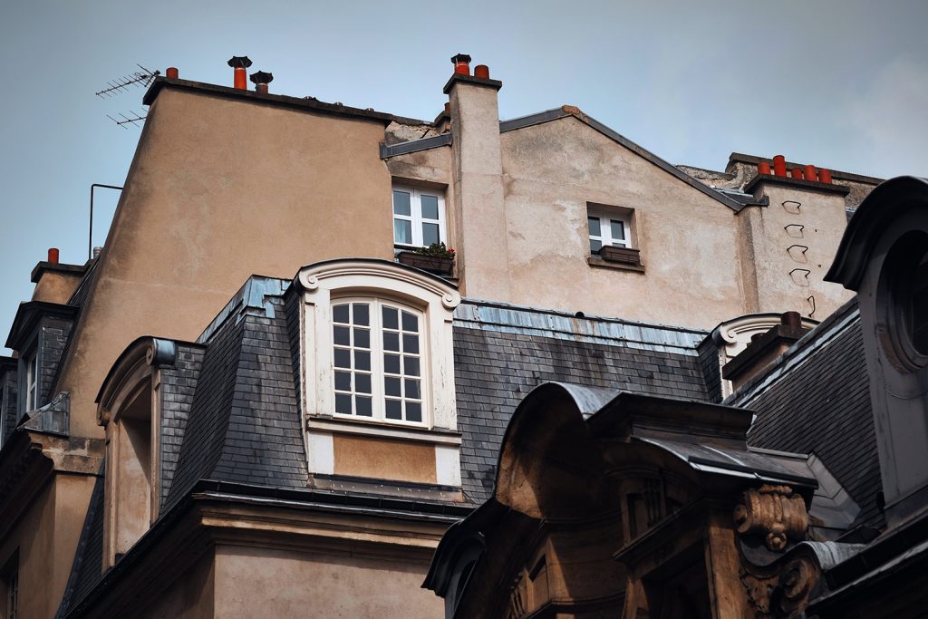
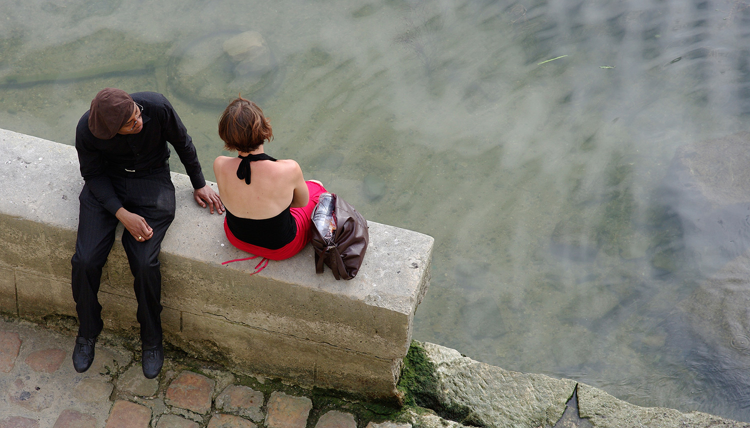
RIGHT: Fuji X-T1 . Fuji XF56mmF1.2 . f/4.0 . 1/2200″ . ISO 200 – Paris
As a designer, it’s fascinating to watch Fujifilm experimenting with different permutations of controls. Sometimes I wish they’d settle down – stop moving the Q button! – but I appreciate that they’re always trying new things as a fairly small company. Each new camera is as much a question as it is an answer – “Is this what works for you?”, and then they roll the findings from posing that question into later cameras.
Also, as someone who has software development experience, I understand the work that goes into maintaining and doing enhancements to multiple versions of interfaces. So I love the fact that Fujifilm as a smaller company go to that effort instead of just dropping support for a last-gen product.

If you’re a challenger brand like Fujifilm, you need to find how to go after the white spaces left by the major players, and you need to develop a unique point of view that stands out. When the X100 came out, there was nothing like it, and Fuji surfed the retro wave for quite a while. But I think they realized they couldn’t be a one-trick pony – look at how trying to make everything conform to the same retro recipe has made BMW MINIs become caricatures of themselves. Between Canon and Nikon getting into mirrorless, Sony becoming a major force, and of course the amazing advances of smartphone photography, it would be suicidal for Fujifilm to sit still.
Having said that, when I’m working with clients for my business, I often preach the mantra of streamlining their offerings as it’s so hard to properly design and support a really wide array of products intended for slightly different audiences. The X100 was such a labor of love, and this really came through to the people who bought it. I do think Fujifilm is at risk of spreading itself too thin, and developing products that don’t have that same attention to detail and laser focus on who the user is. You could say Fujifilm needs to ensure it maintains the soul of its products!

To conclude, we would like to thank you once again for this unique opportunity, which has brought us so many good memories. We’ll keep an eye on MASS MADE SOUL and look forward to seeing what news you have in store for us in the future! Or should we say, oldies?
Thanks so much for getting in touch and giving me a chance to share a bit of my story!


RIGHT: Fuji X-H1 . Fuji XF16-55mmF2.8 @20mm . f/3.6 . 1/30″ . ISO 1600 – Space Shuttle


RIGHT: Pentax K20D . f/6.3 . 1/250″ . ISO 400 – Mongolia


“I’m a designer who’s had a lifelong passion for photography. I started out at a young age wanting to be a car designer, but I ultimately shifted into more generalized industrial design (design of mass-manufactured products). I was born in England, but I’ve lived in the USA for most of my life.”



Albert Smith
September 22, 2022 @ 1:51 pm
I really enjoyed this, Adam. As an old person, I miss the uniqueness of things when they were not put out in cookie cutter form… everything looks like everything these days.
This was a nice project.
worktime
October 7, 2022 @ 10:52 am
I really want this camera
David C.
October 19, 2022 @ 12:46 pm
Hi Adam, I surely agree! It’s not only the products, we are loosing our souls, our ability to make any product stand. Designs are dull and without character, as an example cars! We are loosing the capability in putting art and soul in what we do and create. It’s like dying slowly. Great pics, I am also a photographer, I use Canon for the most, but I do general photography, anything that catches my eye.