How I printed this photo of The Shard – London
So, last year I decided to buy my first professional printer in a bid to start printing my own images at home. I was at the UK Photography Show in Birmingham and I brought the Canon PRO-10S. This printer had a show exclusive £150 cash-back on it’s already reasonable purchase price of £500 so in end I paid £350 for it. Bargain!
Although there are cheaper and more convenient ways to get my images printed by using third party printing labs, I wanted to own the entire creation process from capture to edit and then print with the aim to experience more of my work in a tangible print form while careful selecting the paper and styles to get the print exactly how I want the finished article to look.
I’m not going to cover in this post how I originally edited the image I chose to print, nor the process around calibrating screens as this is a topic for another day. In this post I will run through how I prepared the image to print and talk about some of the settings I used along the way. If you want to read a post covering how I edited a print from RAW to finished image, see this blog post.
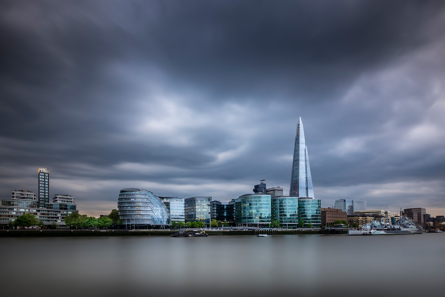
Below is the photo I decided to print. This is a long exposure photo I took of The Shard in London from across the River Thames. This is a great spot to capture an iconic view of London and what’s great about it is that although the vantage point is private property on the grounds of the Tower of London, they don’t have restrictions around the use of tripods which can be an issue elsewhere in London. That being said, the usual rules should still apply when using a tripod in busy areas such as not getting in peoples way and being polite and thoughtful of those around you.
Step 1: Choosing the right Paper
I learned quite quickly that it’s particularly important to ensure the photo matches the paper it is printed on. Some images just won’t look at their best when printed on a high gloss paper and likewise, other images wouldn’t be at their best with a matt finish. For that reason I chose to print this image in particular as with the reflections in the glass and highlights in the clouds and water, it was crying out for a glossy, vibrant finish and I just happened to have recently bought some of Fotospeed’s Metallic Gloss paper to test out. See here for Fotospeed’s own description of this particular paper:
Metallic Gloss 275 is a flat, stiff, middle-weight paper with a metallic effect gloss finish. The paper has a neutral white base and an instant dry, microporous coating. This paper has a wide colour gamut and a high D-MAX which delivers beautiful images, both in colour and B&W.
Step 2: Preparing the Image
Now with paper and image chosen, I went about preparing the image for print in photoshop. Since this image is already processed, I didn’t need to do a lot to it to get it ready but I do think these steps are crucial to ensure the image looks its best in print.
1 – Start with the highest quality image you have: When I edit photos, I always export a gold master copy in TIFF format. TIFF does not compress the image and from this gold master, all copies of the image can be made from a consistent baseline. I will create lower resolution copies for web or like in this instance, edit a copy in readiness for printing.
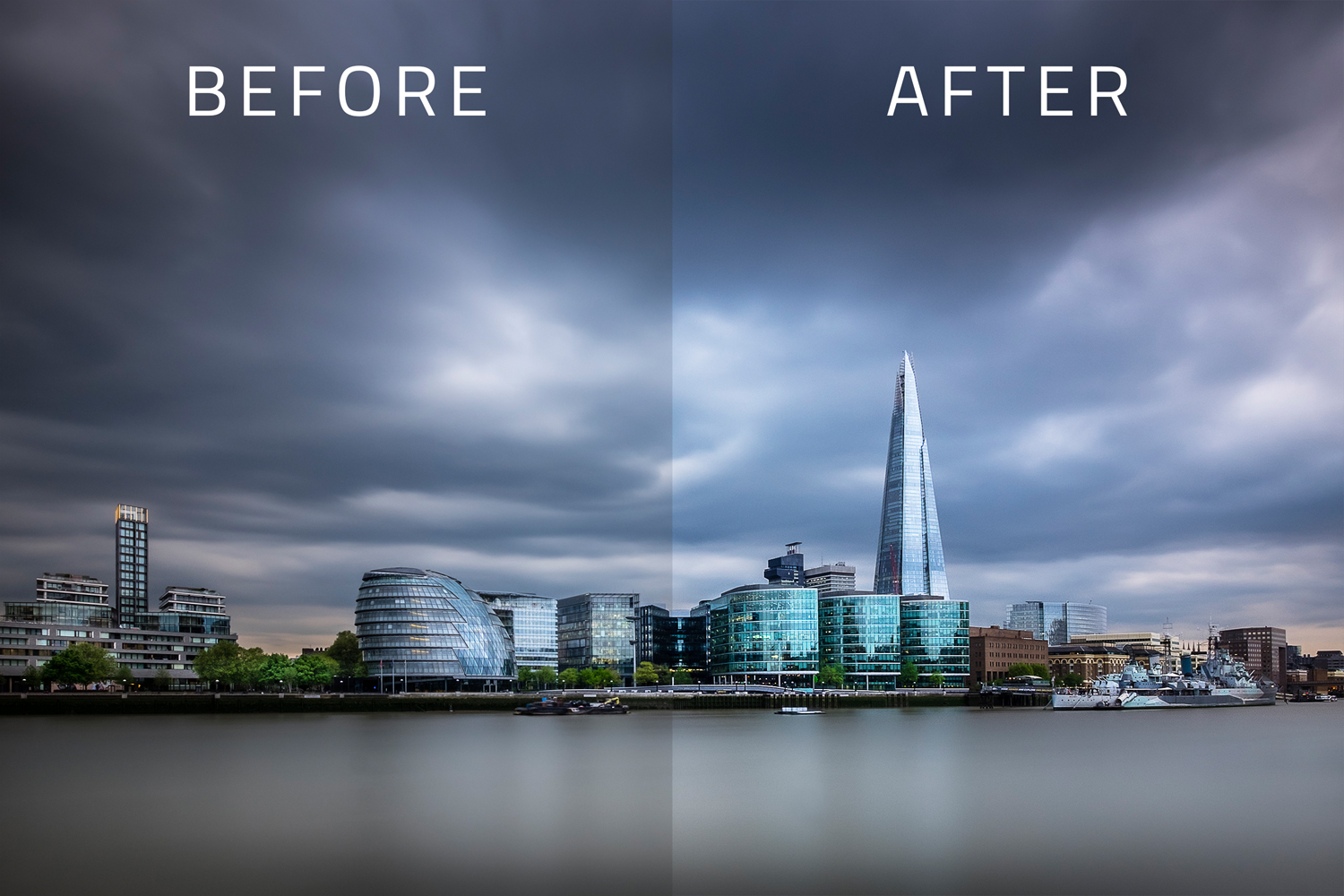
2 – Brightness and contrast: There is a big difference between how an image is illuminated between on screen display and print. On the screen, the image will be back-lit and appear brighter whereas on print, the image is illuminated via reflective light so it will react to the environment. If the room is dark, the print will be dark. As such, I always increase brightness and add a little contrast to my images before printing. For this image I increased brightness by 20% and contrast by 10%. As always, watch those highlights and shadows by using the histogram and make use of a layer mask to mask out the effect where needed.
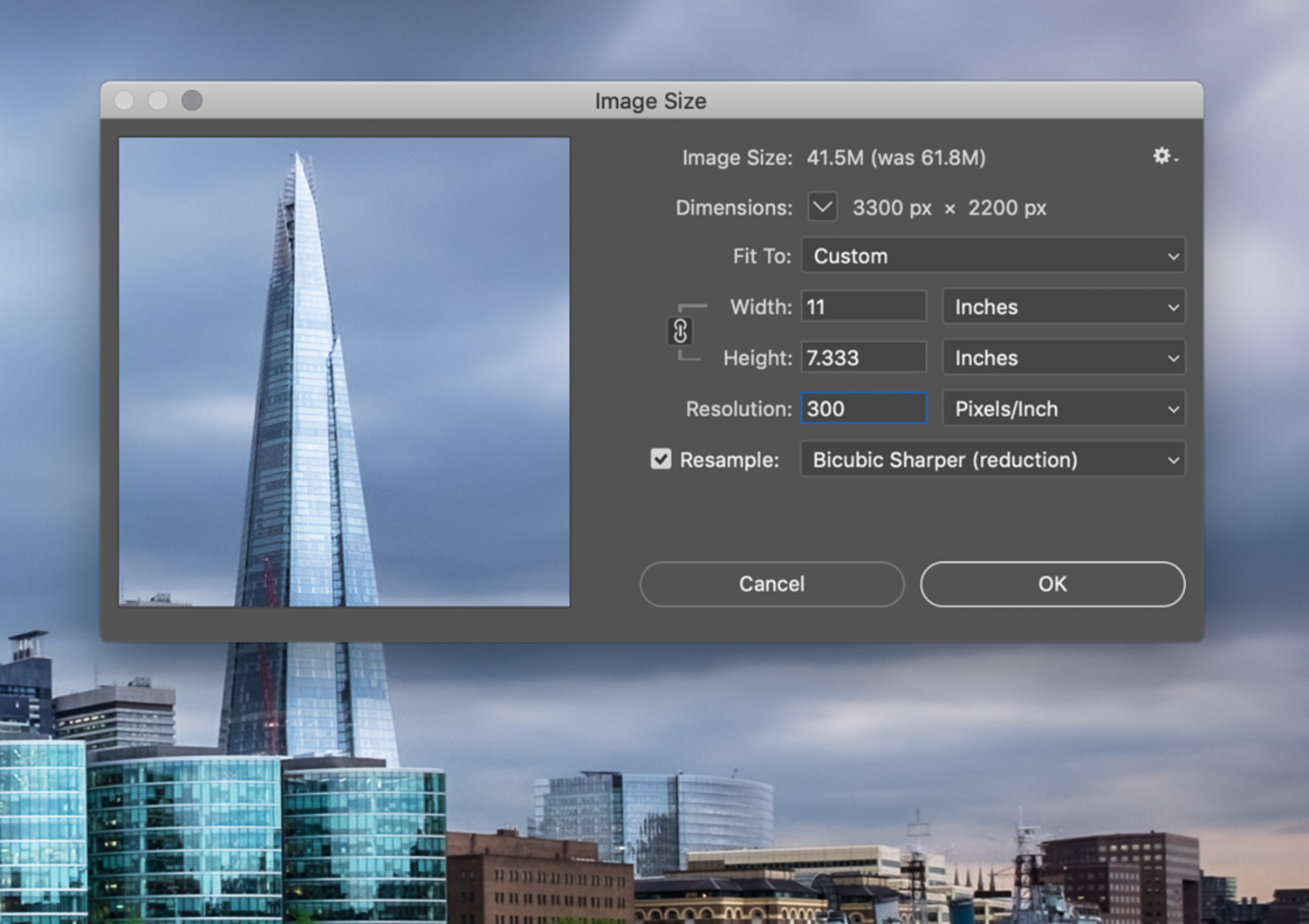
3 – Resize the image: I always resize my images at this stage to ensure the image is at the right size to print to prevent resizing taking place at the print stage. I will use the Image > Image Size option in the menu and use the appropriate recommended settings to ensure the image is the exact dimensions I want to print the image. I used the following settings:
- Width = 11 inches (to print on A4 paper with a small border)
- Lock aspect ratio to auto adjust the height
- 300 pixels per inch for print resolution quality
- Reduction option to preserve sharpness on the resample option
4 – Sharpen the image: I always sharpen my images a little when I print. In Photoshop, I create duplicate layer of the image, and I use the High Pass filter (Filter->Other->High Pass) add a 1-2 pixels to taste being careful to not to add too much to keep the image looking at its best. In this image, I added 1.5 pixels. Next, to allow the base layer to show through, change the blending mode to Overlay on the layer with the High Pass filter applied.
5 – Vibrance and Saturation: The last thing I do before I print is add a little more vibrance and saturation as I notice on colour prints, I can lose a little bit of the punch in the image so I like to add this back a little. With another Adjustment Layer, I added 15% Vibrance and only 5% saturation. Be very careful not to overdo these effects but they need to be adjusted based on the image being printed.
That’s it, the image has been prepared for print. See below for a before and after image. As you can see the effect is noticeable but not extreme and will ensure the image looks fantastic when printed.
Step 3: Printing the image
So, now it’s finally time to get the ink to paper!
Before I printed my image, I made sure that I downloaded and installed the correct printer/paper profile from Fotospeed’s website. This is important to ensure the print, paper and ink all match which goes a long way to ensuring the colours render correctly when the image is printed.
So, still within photoshop and once the print dialog box was open, I chose the following settings:
- Selected the correct printer
- Ensured Photoshop was handling the colour
- Choose the correct printer profile mentioned previously.
- Centred the image on the paper to make an even border
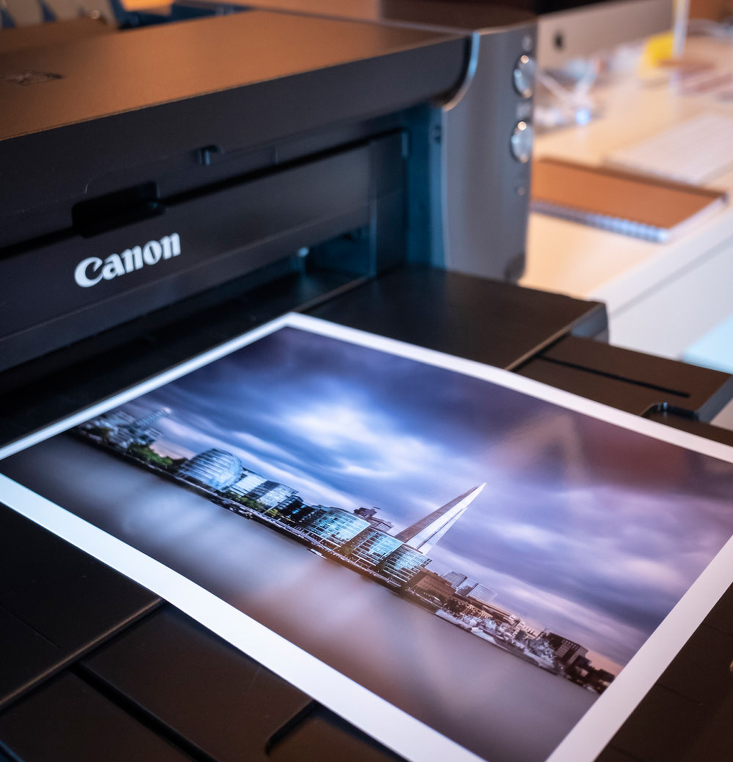
So off the printer went and out came my image. This image was taken as soon as the printing had finished.
Tip: Leave the print at least a few hours before handling to ensure the ink fully dries. The tones may also change a little too so don’t inspect the finished print until it has had tome to dry.
So there you have it…
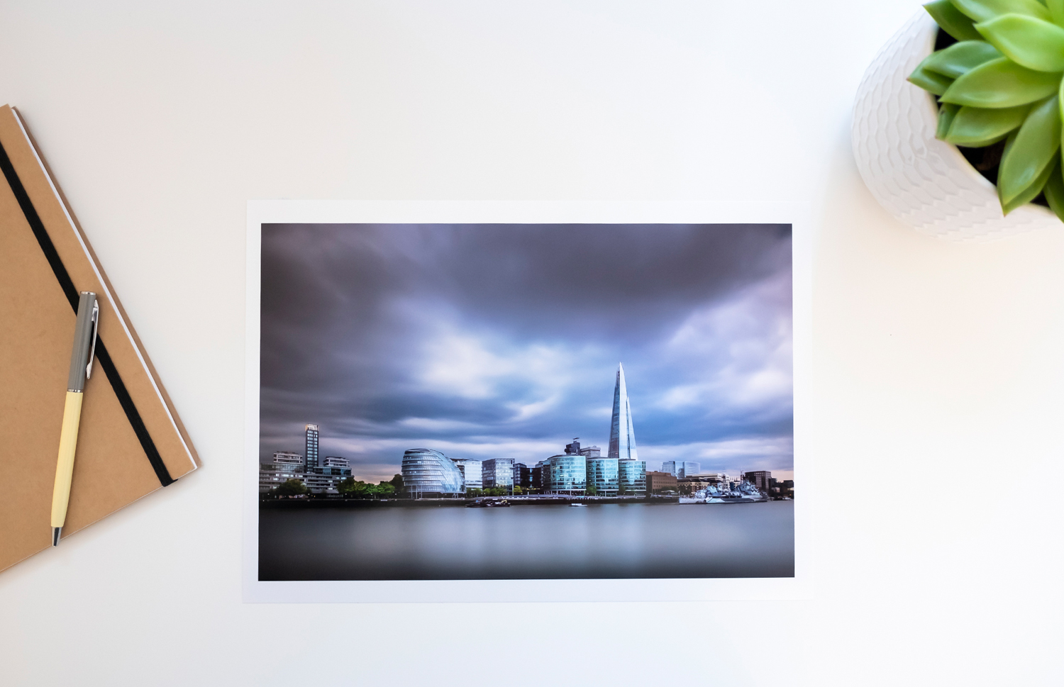
Below is the final print in all its glory. Although this photo doesn’t do it justice as it looks a little too blue/purple, it looks fantastic in person and much more alike to the image at the top of this post.
It was far from a comprehensive overview of the printing process but to some it is quite daunting to try and this post shows that it can be done well with minimal steps.
Feel free to add any of your own tips to simplifying the print process in the comments below.
Until next time.

Trevor is a photography enthusiast living and working in London, UK. He has been enjoying the craft of photography for the last 10 years with a real passion for the London cityscapes and more recently long exposure photography. Formerly a Nikon user, Trevor moved to the Fuji X system in 2016 and has never looked back.


